
×
×
×
This project aims to help make New Zealand health data easy to access and understand for the general public.
I was the sole developer on this project for the vast majority of its development lifecycle.
The Ministry of Health (MoH) in New Zealand have created R Shiny apps before. Prior to Epi-interactive being asked to work on this project, MoH had a publicly accessible tool. The original had numerous issues such as runtime null errors, inefficient calculations, and styling problems.
Epi-interactive were asked create a maintainable application which was capable of loading data files (e.g. statistics, indicator names, and definitions) and updating the tool dynamically. They requested that the app be created using R-Studio’s Shiny framework. This choice was made for the sake of maintainability as many statisticians within the Ministry are proficient R coders. Presumably this was more important to them than the implications of using such a slow language and single threaded web framework.
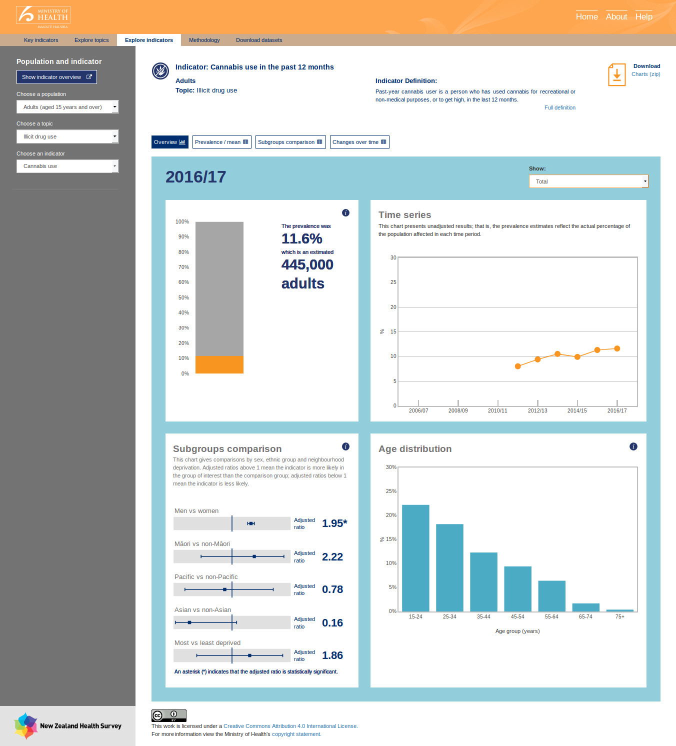
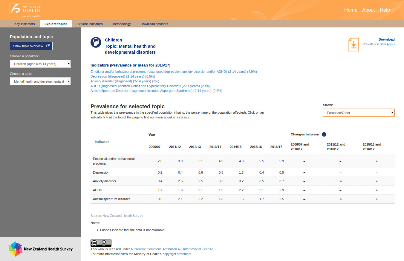
There are a huge number of statistics available in the data files. But unless the data can be visualised, it’s almost useless to a layperson. Part of the challenge for the Epi-interactive team was to identify good ways of visualising the data. I was provided with mock ups to imitate.
The whole application performs filtering and searching in memory. It does this with data frames set up similarly to tables in a relational database with a composite key based on population and indicator.
Almost all charts are dynamic, and have been produced using Plotly. Tables use JQuery Data Tables.
Some challenges in this project were:
- to try an minimise the number of digest cycles run per change. Often when working with Shiny, dependencies require a round trip to the server from the client. e.g. the select input boxes creating a cascade of websocket requests to populate the next. This is naturally how most Shiny apps run as generally they are relatively simple.
- Minimising the memory footprint of each session. As all the data stored in-memory, and each client requires a subset, I needed to filter it down as much as possible as well as only store what is necessary.
- Workarounds for bugs in various libraries. Due to the complexity of some of the libraries in use, it wasn’t feasible to find and patch the bugs. Many had been open in GitHub for quite some time.
- Internet Explorer. Need I say more? CSS problems and slow JavaScript interpreter.
The MoH publication post can be found here
The (now updated since 2017) tool can be found here